It’s been a while since I’ve shared an anecdote from my travels, and this past week produced several funny moments worth sharing. One moment in particular stands out for being both humorous and topical, as it deals with geography. On my first night in Montana, I was sitting at the bar of a local restaurant, when the man sitting next to me struck up a conversation. He had immediately pegged me as an out-of-towner, and asked what I was doing in Montana. I told him I was trying to visit all 50 states, and he asked how many I still had left.
I responded that Montana was the 48th state I had visited, and the only two left are Hawaii and Alaska. He seemed genuinely interested, and asked questions about what states I had liked best, and some of my favorite destinations. After chatting for a while, he asked me about Alaska. Saying something along the lines of “How are you going to see all of Alaska? It’s so big.” I responded that while Alaska is big, “It’s not that big”. The gentleman immediately reached for his phone and pulled up Google Maps, before he even said anything I knew exactly where this was going.

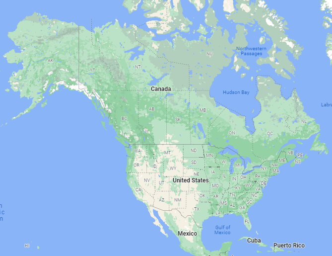
Before continuing, take a quick look at the map above, which is a screenshot from Google Maps. Look at Alaska and compare it to the size of the lower 48. Eyeballing it, Alaska appears to be roughly half the size of the contiguous United States. This is the map the stranger at the bar was showing me, asking how in the world I could think Alaska isn’t that big. I responded that while it’s large, Alaska makes up a little less than 20% of the land in the United States, so it shouldn’t take all that long to see the state. “20%? Are you crazy?”, he responded while pointing to the map on his phone.
At this point I had 2 choices, but as I’ve never passed up a chance for a funny moment, there was really only 1 choice. “You want to bet? I’ll bet you Alaska makes up less than 20% of the land in the United States.” Phone still in hand, staring down at the map, the man was somewhat perplexed by my proposition. He responded sure, and we agreed to $20. But before I said anything else, he turned around to tell his buddy at a nearby table what was going on. Showing him the map on his phone, the friend asked if he could get in on the action. I had no objections. At this point the entire bar had been listening, and there were numerous others wanting a piece of the action.
When it was all said and done, I had 9 people on the other side of my bet, 100% confident of their impending windfall. To settle who was correct, we had a neutral 3rd party at the bar Google, “Alaska percentage of US land mass”. The woman stared at her phone reading the search results, then looked up and smirked. “It says Alaska makes up 17.5% of the United States.” The bar erupted with noise, my counterparties bewildered by the result, asking how is that possible. My new friends in Montana had fallen victim to the Mercator Projection Map.
Chances are, pretty much any map you’ve ever used, whether on your phone or hanging on a wall, was a Mercator Projection. Developed in 1569 by Flemish cartographer Gerardus Mercator, the map had desirable qualities for navigation at sea, and eventually became the primary map that we all use. The details of how its constructed aren’t important here, but the main downside of the Mercator Projection is it distorts the size of landmasses far away from the equator. Are you telling me the map is wrong? Yes, well they are all wrong in a way. Any rectangular 2 dimensional map you’ve ever seen is wrong in one way or another.
The fundamental problem is, you can’t unfold a sphere into a rectangle. So when we try to convert the Earth into a 2 dimensional map, certain adjustments have to be made, and no matter how you do it, the map will be distorted in some way. With the Mercator Projection, the primary distortion is that the further away from the equator a landmass is, the larger it appears. That’s why on the map, Alaska appears so much larger relative to the rest of the United States.

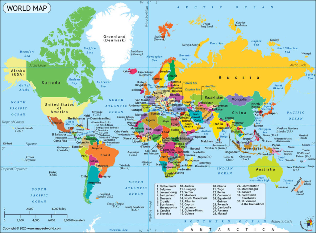
Take a look at the world map above, any guesses on which countries you thought were huge but really aren’t? My favorite is Greenland, which appears to be roughly the same size as Africa, when in reality the continent of Africa is 14 time larger. Makes the misunderstanding with Alaska look pretty minor. How about Russia? Russia is in fact the largest country in the world, but the map makes it look as though it dwarfs all other countries. In reality Russia isn’t even twice the size of the United States.
This was all news to my friends at the bar, and I’m guessing it’s new information for many of you reading this. We grow up learning geography on maps, yet the shortcomings of those maps are never discussed. This anecdote comes from Montana, but I easily could have had this same conversation in any of the 50 states. For those of you who found this interesting, or at least a little bit amusing, play around with the map for a bit. Look at the size of different countries and then Google their actual sizes, you might be surprised what you find.

I didn’t know the Mercator name, but I knew of the distortion factor, particularly Greenland. I wouldn’t have taken your bet.
I have heard that Alaska is about the size of Texas, maybe a little bigger. I don’t know, but I’ll aska (get it? Bad dad joke).
So what are your plans for the $180? Did they all pay up? 😂
Yes, what was your net profit on the map bet? Curious minds want to know!
It was more than $180. Some of the later bettors were so confident based off Google Maps that they upped the stakes. Not sure exact amount but probably about $400.